augment every surgery
EXTEND YOUR VIRTUAL SUrGICAL PLANNING WITH AUGMENTED REALITY
Learn More About Us
View surgery Differently

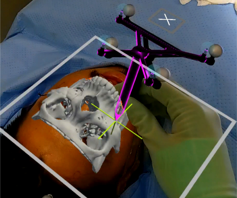
With FDA-cleared IntraOpVSP, patient data translates from two-dimensional TV screens and monitors into three-dimensional extended reality to provide a heads-up reference during surgery.

Discover XIRONETIC
built for speed & precision

Utilize intuitive voice commands and gesture interfaces to view and interact with holographic patient data in the operating room. Integrate data from common preoperative imaging methods such as CT and MRI.

see how it works
reach out and see how surgery can change for you
Request A Demo
augment every Surgery

IntraOpVSP is designed for use during surgery and for preoperative planning, with a wide of applicability across a variety of surgical disciplines, including craniofacial, maxillofacial, neurosurgery, and vascular surgery.

Webflow Repsonsive Flexbox Grid v1.2

A Webflow ready, Responsive Flexbox grid system based on a 12 column layout.
Clone  Flexbox GridGet Started with Webflow

Getting Started

Columns need to be nested within  a "row" and a direct child of a "container".  All columns start off at equal-widths by defining the class of "col" and auto-collapse at the mobile portrait breakpoint if no responsive classes are defined. 
col
col
col
col
col
col
col
col
col
col

Remove Gutters

To remove all padding from columns, use the "no-gutters" class preceded by the initial class of "col".
 no-gutters
no-gutters
no-gutters
no-gutters

Full Width Container

Define your div with a class of "container-fluid" for full width.
col
col
col
col

Responsive Grid

Grid - Desktop

To define our 12 column grid, all classes must precede with the initial class of "col"
col-1
col-11
col-2
col-10
col-3
col-9
col-4
col-8
col-5
col-7
col-6
col-6
col-12

Grid - Tablet (Breakpoint)

Defining our tablet breakpoints, all classes must precede with the class of "col" and if defined, your desktop class of "col-(1-12)"
col-m-1
col-m-11
col-m-2
col-m-10
col-m-3
col-m-9
col-m-4
col-m-8
col-m-5
col-m-7
col-m-6
col-m-6
col-m-12

Grid - Mobile Landscape (Breakpoint)

Defining our tablet breakpoints, all classes must precede with the class of "col" and if defined, your desktop and tablet classes of "col-(1-12)"
col-sm-1
col-sm-11
col-sm-2
col-sm-10
col-sm-3
col-sm-9
col-sm-4
col-sm-8
col-sm-5
col-sm-7
col-sm-6
col-sm-6
col-sm-12

Grid - Mobile Portrait (Breakpoint)

Defining our tablet breakpoints, all classes must precede with the class of "col" and if defined, your desktop, tablet and mobile landscape classes of "col-(1-12)"
col-xs-1
col-xs-11
col-xs-2
col-xs-10
col-xs-3
col-xs-9
col-xs-4
col-xs-8
col-xs-5
col-xs-7
col-xs-6
col-xs-6
col-xs-12

Column Wrapping

If responsive columns are placed within a single row and which the total result in greater then 12, they will automatically wrap onto a new line.
col-4
col-8
col-6
col-6
col-3
col-2
col-7

Vertical Alignment

Align-Start

To align columns from the top, combine a class of  "align-start" preceded by the class of "row"
align-start
align-start
align-start

Align-Center

To align columns from the center, combine a class of  "align-center" preceded by the class of "row"
align-center
align-center
align-center

Align-End

To align columns from the bottom, combine a class of  "align-end" preceded by the class of "row"
align-end
align-end
align-end

Horizontal Alignment

Justify-Start

To align columns from the left, combine a class of  "justify-start" preceded by the by class of "row"
justify-start
justify-start

Justify-Center

To align columns from the right, combine a class of  "justify-center" preceded by the class of "row"
justify-center
justify-center

Justify-End

To align columns from the right, combine a class of  "justify-end" preceded by the class of "row"
justify-end
justify-end

Justify-Between

To evenly space columns between each-other, combine a class of  "justify-between" preceded by the class of "row"
justify-between
justify-between

Justify-Around

To evenly space columns around each-other, combine a class of  "justify-around" preceded by the class of "row"
justify-around
justify-around

Self-Align Columns

To individually self-align columns, combine a class of  "self-start", "self-center", "self-end" preceded by the by class of "col"
self-start
self-center
self-end

Column Reordering

To individually reorder columns, combine a class of either "order-first", "order-last", preceded by the by class of "col"
order-last
order-first